 As a longtime bike commuter I have watched with great interest as the design of bicycle facilities has evolved in recent years. Traditional bike lanes were a welcome addition and a good place to start, but often were not addressed through street intersections, leading to confusion and potentially unsafe conditions when bike and vehicle traffic mix. The lack of clear guidance at these conventional intersections may also contribute to a high rate of cyclists ignoring traffic signs and signals, which we’ve all seen. My colleague Jim Sandlin has previously discussed how roundabouts offer safer bicycle conditions at intersections. However, most intersections are controlled via a stoplight or a stop sign. Let’s look at some of the best new ways to integrate bike traffic in intersections.
More and more designers are committing to the “complete street” concept, which accommodates all modes of transportation. “Innovative bicycle facilities” refers to the new generation of complete street improvements designed to increase clarity and safety for cyclists, such as separated bikeways, green paint, and separate bike signal phases. There are many creative and effective solutions, but at this early stage they are being developed and implemented without a consistent set of design guidelines – at this time the Federal Highway Administration’s Manual on Uniform Traffic Control Devices lists most innovative bicycle facilities as “experimental” status, if it includes them at all. Going forward, the challenge for transportation designers will be to develop a consistent language of road elements so that all street users, regardless of vehicle, understand how to safely navigate roadways with increasing numbers of cyclists in the mix.
A recent survey in Portland had street users (regardless of type of vehicle they use) identify the type of bike rider they are:
On a good day I ride like the 1% group - often keeping up with the flow of traffic, merging and turning the same way I do when driving. But when I’m riding at a casual pace, the faster vehicle traffic becomes a force that is difficult and intimidating to mesh with, and the need for bike-specific road elements becomes clear. In order for the 60% “interested and concerned” category of street users to feel comfortable riding with vehicle traffic, the streets need to be carefully designed for safety and clarity – especially at intersections, where the most potential conflicts occur. In essence, we need to begin thinking about “complete intersections” as well as complete streets. Below is a brief overview of the current strategies for improving cyclist safety and confidence at intersections, plus considerations for designers.
Bike Boxes
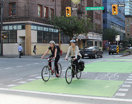
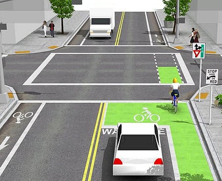
These are painted areas (often green) ahead of the vehicle stop bar, at signalized intersections only. They create the space for cyclists to move ahead of stopped cars, where they will be much more visible to drivers waiting for a green light. Bike boxes are intended to prevent “right hook” collisions, and also allow cyclists to position themselves to take left turns without crossing traffic.
Bicycle Forward Stop Bars
Similar to bike boxes, bicycle forward stop bars are used at stop sign intersections with traditional bike lanes. The vehicle lane’s stop bar is set further back from the bike lane’s stop bar, so a stopped cyclist is much more visible to a stopped driver. Again, this is intended to prevent “right hook” collisions.
Green Pavement Paint
Green paint is generally used to highlight specific areas of the bikeway where there is higher potential for conflict with vehicles, such as turning lanes, driveways, bike boxes, and sometimes for the whole bikeway through an intersection. The key is that it serves as a warning to both cyclists and drivers.
In some areas, New York City being the biggest example, the green paint is used to mark the entire bikeway except the potential conflict zones. This may make sense in a place like New York, where the green paint serves as a reminder to keep pedestrians out of the bike lane. Last time I was there though, I saw more pedestrians using the bikeways than cyclists - crowded sidewalks! But in most other places it’s better to use the green paint only to mark conflict areas, because it is a clear and consistent signal, and far less expensive to install and maintain.
Two-Stage Turns (aka the Copenhagen Turn)
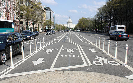
In a busy intersection it can be difficult or impossible for a cyclist to merge into traffic in order to take a left turn. The same is true for a cyclist trying to turn right from a left-side bike lane across one-way traffic. In the two-stage turn, the cyclist goes straight into the intersection, and then waits in front of the stopped cross traffic. When the light turns green, the cyclist proceeds straight forward with traffic in the direction intended for the turn.
Two-stage turns are not what most people are used to, so to be successful they depend on clear pavement markings and signage, and possibly road user education.
Mixing Zones at Turn Lanes
One of the more common conflict points is when drivers need to cross a bike lane in order to use a turning lane. In Portland the bike lane is usually continuous and highlighted green through these areas, as an indicator to drivers that they need to make sure there is an opening before crossing that lane.
However in some cities entire vehicle lanes have been converted to separated bikeways. The need still exists for vehicles to cross the bikeway in order to turn, but there is not enough width to add a separate turn lane. Instead, a mixing zone is provided to allow the vehicle traffic to merge into the bike traffic before turning. This prevents sudden turns across the bikeway, and prevents vehicles waiting for an opening to turn from blocking through traffic.
Bike-Specific Signals
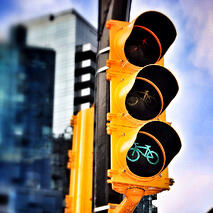
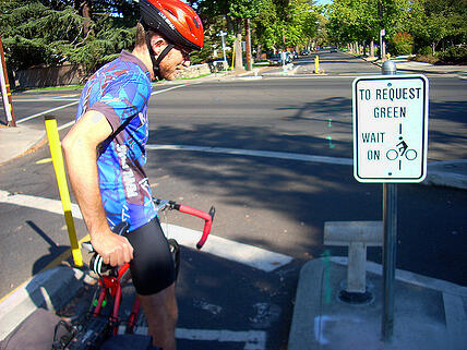
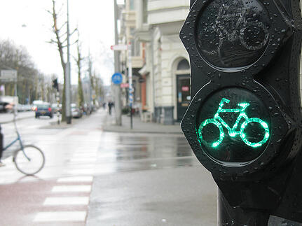
When signals are added specifically for cyclists, it allows for fine-tuning the signal phases to maximize the safety and efficiency of the intersection. For example, the bike signal may turn green first, allowing cyclists to proceed before drivers so they can turn unimpeded. To be most effective, detection loops (sensitive enough to detect bikes) should be installed at the intersection and well ahead of the intersection.
Turning Restrictions for Vehicles
Separated bikeways are sometimes installed down the middle of a street, which has advantages but can complicate intersections. It can often make sense to restrict vehicles from turning left across the centered bikeway, because overall traffic will move more efficiently without waiting for additional signal phases for left-turning drivers.
Separated Bikeways at Transit Stops
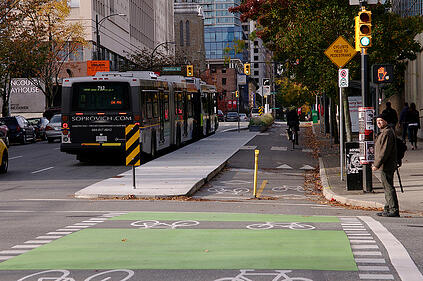
Bus and light rail routes often share the street with a bike lane. It usually doesn’t make sense to create the pattern of conflict where the transit route and bike lane weave across each other at every transit stop. To avoid this the bike lane can become a separated bikeway at each transit stop, moving behind the whole stop. That turning movement will naturally slow riders as they pass the stop, but signage will be needed to warn riders that pedestrians from the bus/train will be crossing the bikeway, and vice versa.
If a bikeway does need to cross train tracks, the route needs to cross as close to perpendicular as possible. I’ve known too many riders who have launched over the bars after getting their skinny front tire stuck in a track!
Think Complete Intersections
Bike lanes are great, but bike lanes alone are not adequate at intersections. Designers need to take the complete street idea to heart and expand it to intersection design. If you’re designing a new intersection, I encourage you to think beyond automobiles and consider how to make the intersection safe for all modes of transportation. If you’re retrofitting an existing intersection, I hope you’ll be bold in promoting bicycle safety through one of the design elements mentioned above, or possibly even coming up with another innovative idea. Let’s build complete streets and complete intersections.
Items for Designers to Consider
-
Clarity and consistency of signage, signals, and pavement markings. Pedestrians, cyclists, and drivers all need to be clear on how the intersection is intended to function so that they can share the road effectively.
-
An educational campaign targeted at all users may be necessary when the first innovative bike facilities in an area are introduced, because they are often a departure from how we are all used to using the road.
-
Review precedents to find successful approaches.
-
Busy driveways are potential conflict points and should be treated as intersections.
-
Visibility at corners – obstructions such as parked vehicles, signs, etc.
-
A successful intersection is just one link in the chain – a truly successful bike network takes careful planning to establish key corridors which are comfortable routes linking key destinations.
Reference standards for innovative bikeways:
NACTO Urban Bikeway design guide
CROW Design Manual for Bike Facilities (Netherlands)
AASHTO Guide for Development of Bicycle Facilities
City design manuals: Minneapolis, Chicago, Portland, New York City, San Francisco
State DOT bicycle design manuals
MUTCD – upcoming version will have more content for innovative bikeways
Reference standards for traditional bikeways:
AASHTO
DOT design manuals
MUTCD – currently need to apply for experimental status to go outside of traditional bikeway standards
Source references for this blog:
Bicycle Facility Evaluation. District of Columbia Department of Transportation. http://nacto.org/docs/usdg/bicycle_facility_evaluation_ddot.pdf
Evaluation of Innovative Bicycle Facilities: SW Broadway Cycle Track & SW Stark/Oak Street Buffered Bike Lanes. City of Portland Bureau of Transportation. http://bikeportland.org/wp-content/uploads/2011/02/PSUCycleTrackBBLReportFINAL.pdf
Innovative Bicycle Facility Treatments. Rick Plenge, P.E, PTOE, Fehr & Peers. http://acec-co.org/wp-content/uploads/2013/04/InnovativeTreatments.pdf
Bicycle Facilities and the manual on Uniform Traffic Control Devices. Federal Highway Administration. http://www.fhwa.dot.gov/environment/bicycle_pedestrian/guidance/design_guidance/mutcd/
Image references for this blog:
 As a longtime bike commuter I have watched with great interest as the design of bicycle facilities has evolved in recent years. Traditional bike lanes were a welcome addition and a good place to start, but often were not addressed through street intersections, leading to confusion and potentially unsafe conditions when bike and vehicle traffic mix. The lack of clear guidance at these conventional intersections may also contribute to a high rate of cyclists ignoring traffic signs and signals, which we’ve all seen. My colleague Jim Sandlin has previously discussed how roundabouts offer safer bicycle conditions at intersections. However, most intersections are controlled via a stoplight or a stop sign. Let’s look at some of the best new ways to integrate bike traffic in intersections.
.jpg?width=441&name=7998502688_84086c53e1_z_(1).jpg)


Leave us a comment below